Green and Black’s
Organic Chocolate
Organic Chocolate
Branding
Packaging Design
Packaging Design
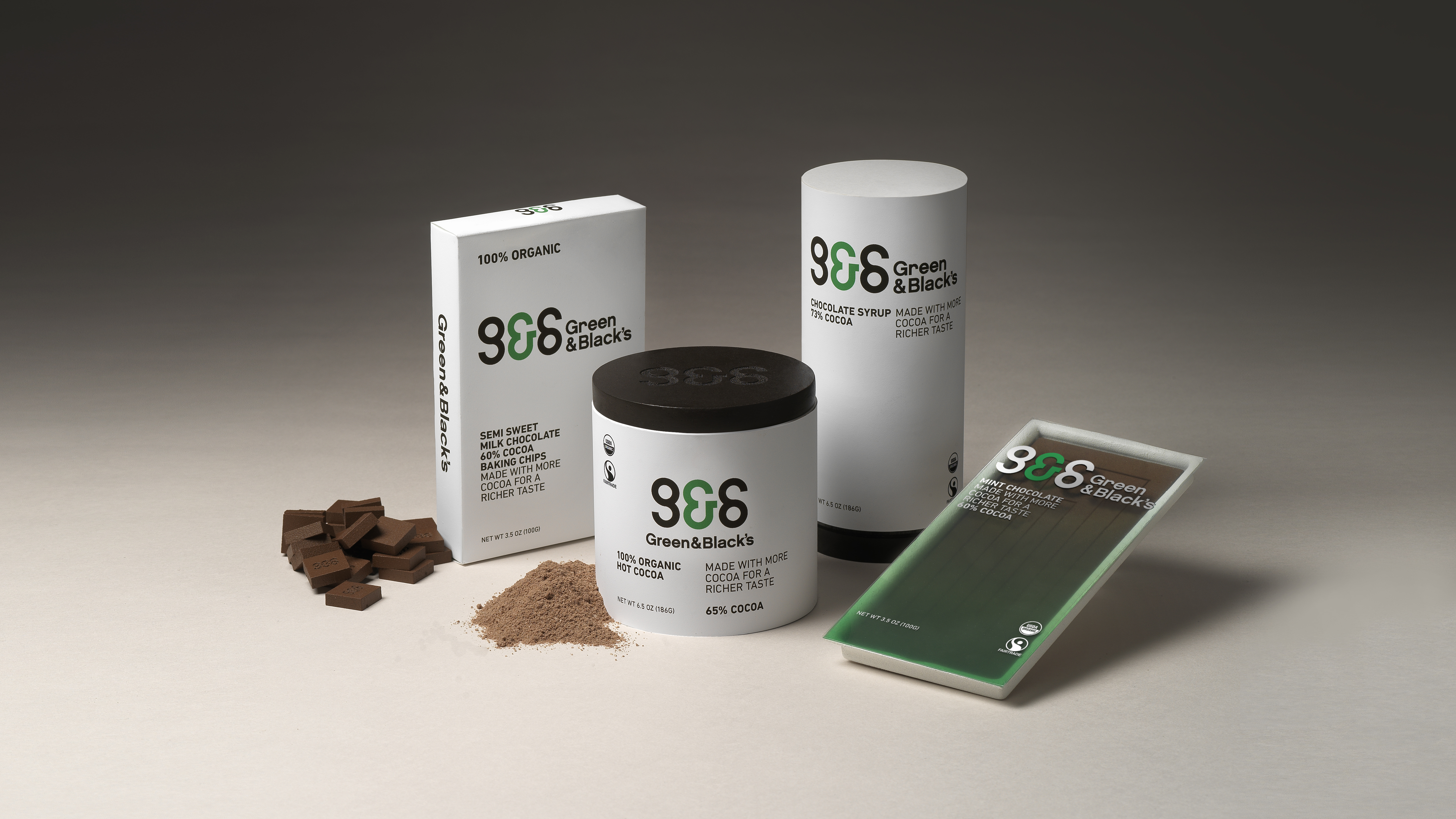
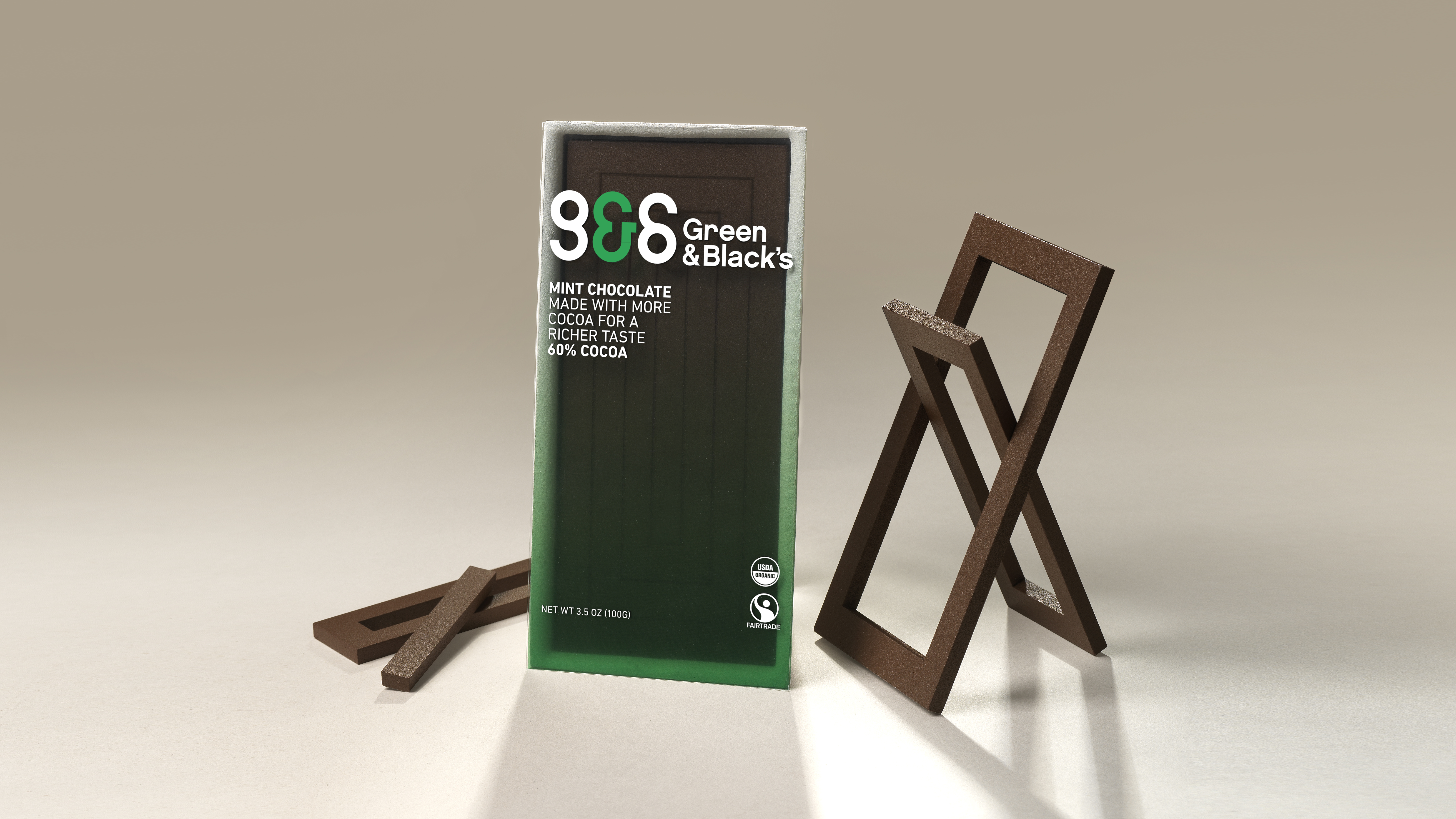
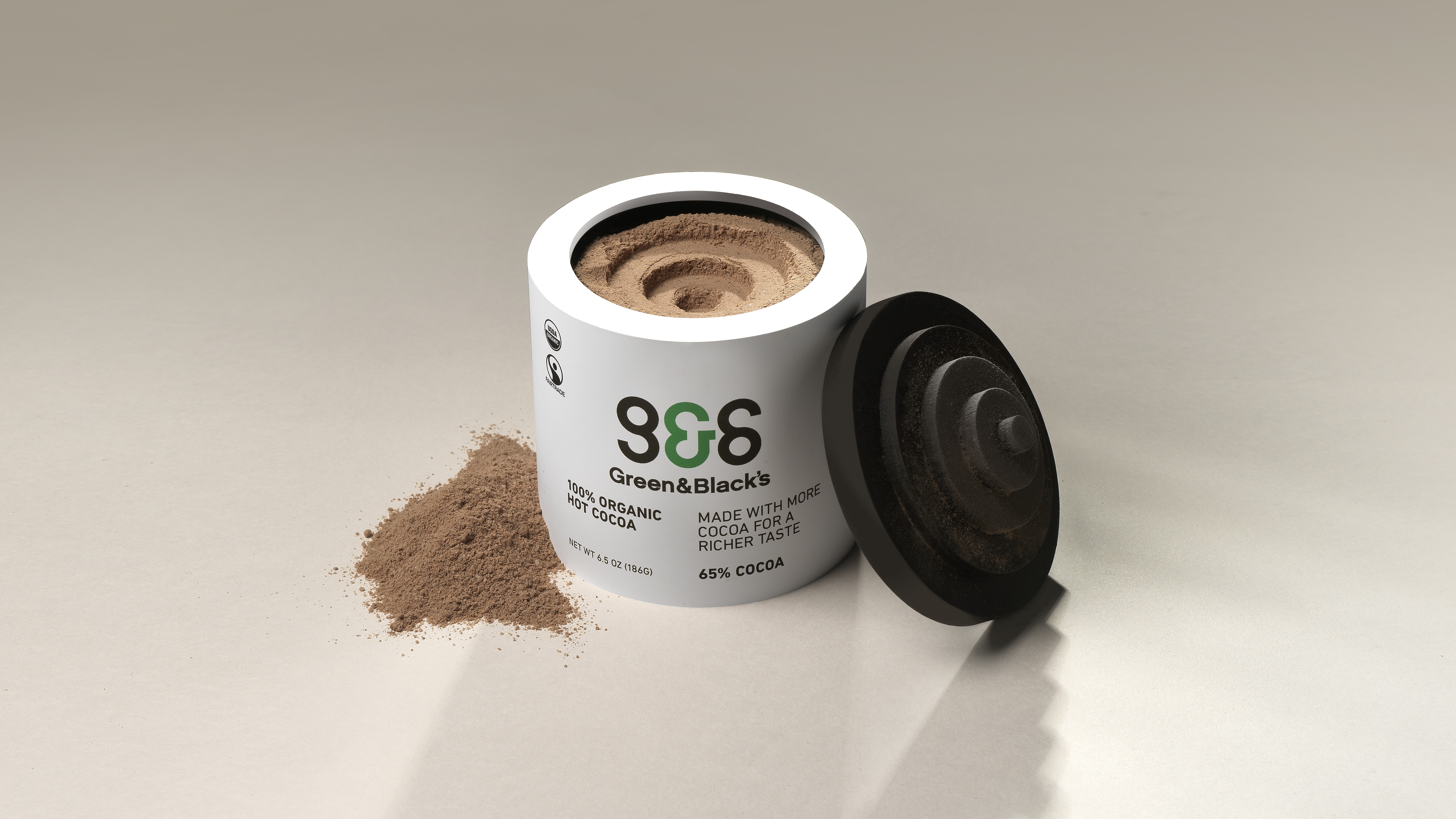
Current chocolate packaging out in the market are beautiful, smooth, well-crafted, and wrapped with the finest fabrics. The focus is around the exterior beauty of chocolate when chocolate should be about embracing its true nature. This includes, how it breaks, the spirit of chocolate, and the complexity of the production. Using this fundamental idea, I’ve decided to contrast the norm by appreciating the way we eat and look at chocolates.

Thought Process
To begin, I needed to understand how chocolates are sold, made, and displayed. I realized that if a package isn't rectangular, it won't be placed in the same aisle as most other chocolates. After experiencing the chocolate-making tour at Mast Brothers and learning about the philosophy of Green and Black's, I've come to understand the importance of ensuring that consumers truly enjoy the chocolates. Additionally, it's vital to design chocolates with the makers' perspective in mind, considering elements like the production process and how the chocolates are molded. Combining these insights, I've decided to redesign the chocolates based on how we create them and how we share and break the pieces apart.
Target Audience
My target audience consists of early adopters who are open to trying new things. They lead active lifestyles and spend a significant amount of time outside their homes. The product should be designed to be gender-neutral and carry an implicit cool factor. To successfully capture their attention, the packaging must be intellectually engaging. These consumers value simplicity, performance, and quality.
